Fortune 500 Company & Bradley Student Design Challenge
Team Size:
3 People
Duration:
8 Weeks
Problem:
Since a number of machine operators at a Fortune 500 company face a language barrier when operating expensive machinery, this opens the possibility for lower amounts of operator efficiency as well as higher amounts of property damage. With only having vague symbols to rely on, these operators may struggle with understanding coaching tips, correcting their mistakes, and using the machines in general.
In order to reduce both issues of lower operator efficiency and higher amounts property damage, my team and I conducted a number of different research methods as well as visited the company’s facility to get a better understanding on how to approach the issue.
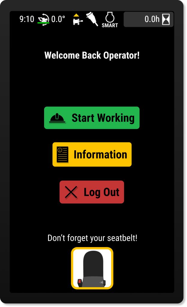
My team and I decided to approach the problem by redesigning certain aspects of the excavator display system, such as menu layouts, iconography, and the addition of an Icon Library and instructional tutorials to inform the excavator operators and prevent devasting mistakes or damage.
Along with redesigning the excavator display system, we also participated in several user tests with excavator operators to ensure our prototype was utilizing user-centered design.
Personal Contribution:
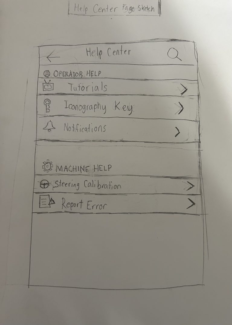
1. Early Design Sketches. Before we began implementing our solution, all team members sketched a design for the "Help Center" page on the excavator display system. This "Help Center" page was going to be where an excavator operation could find such features like the "Icon Library" and instructional tutorials.
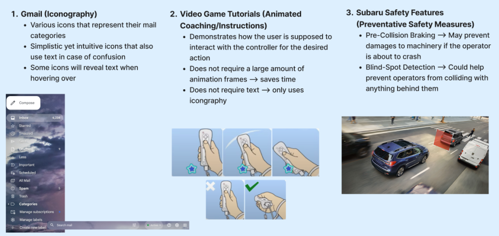
2. Lightning Demo. As a method of brainstorming ideas to implement into our design, all three of us benchmarked certain features from various forms of media to potentially include within our excavator display system redesign. Ideas such as the focus on iconography as well as the animated coaching ended up being implemented in our final design.
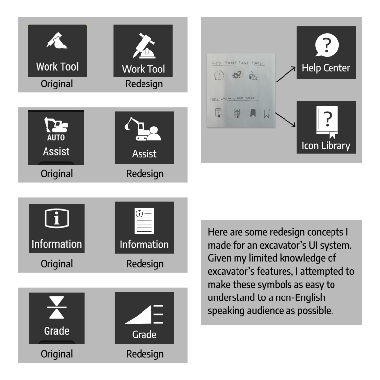
3. Icon Redesigns. In order to make the iconography clear to a potentially illiterate audience, I was tasked with redesigning any unclear icons found on the excavator display system. In addition, I also developed the high fidelity icons used for our "Help Center" and "Icon Library" pages.
4. User Testing. For usability testing our design, all three of us took turns being the proctor with different operators to while the other two members took notes of the user's actions when given a task. While being the proctor, we could not help the users with the tasks whatsoever to ensure authentic results for each individual.
Iterations from User Testing:
- Added search functions for tutorials, apps screen, and icon library. - Replaced app screen icon to hamburger menu icon. - Combined Information and Help Center apps.